
You probably are capable right now of creating a cover for your eBook that looks decent enough to publish until you can afford to pay a pro to give you a pro result.
Are you ready? Great. First, the disclaimers: You will have to do some work here. Like everything else in life, the more effort you put in, the better your results. I will give you some ideas and show you a step by step example, but it the end you still need to expend some brain cells. And if your computer melts because of anything in this tutorial, it’s not my fault. Okay, here we go.
1. Decide what your end result needs to be, then figure out what you need to get there. Our end result is a thumbnail graphic at the Kindle eBook Store.
Their thumbnail sizes are 115x115. That is pretty small. And some of it is white space. I looked at five random thumbnails and the actual image size ranged from 75x115 to 92x115. So we want to make something clearly readable at that size. Obviously we also want it to look good at larger sizes too. That’s our end result. How do we get there?
2. Unless you want to use abstract geometric shapes, you are going to need some kind of picture or graphic for your cover. I said this would use brain cells remember? Check out these resources for images:
Kindleboards Cover Art thread
Another Kindleboards Cover Art thread
Morguefile has all kinds of free images
stock.xchng has more free images
And check out NASA and Public Domain Images at Wikipedia
Just be sure to read the fine print, copyright info, and image license for any image you plan to use. Ideally, you can just use a picture that you have taken yourself, and not have to worry about any copyright issues. You won’t sue yourself, right?
I’ll use Photoshop for this tutorial, but the general concepts should apply to any graphics editing program. Here’s one you can download for free:
Gimp, free image editing software
Or try Piknik for online photo editing
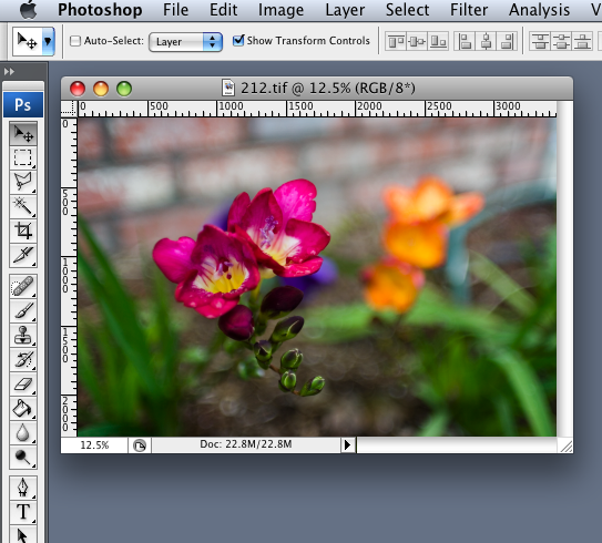
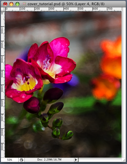
3. Okay, let’s get to it. Our example eBook cover is going to be for a hypothetical novel called The Galactic Flower. Woohoo, boy will that fly off the electronic shelves! Our sample cover won't be a stellar work of art, but hopefully it will teach you a few key concepts. I’m going to flip through the ‘ol hard drive and find a picture to use. Here’s a snapshot I took one rainy morning of a flower bed:
Side note: this pic was taken with an older Canon digital SLR camera, using a 30 year old manual focus lens. Talk about shoestring budget: that old lens cost about 1/10th the price of a comparable new piece of glass (call lenses “glass” if you want to sound cool to photographers.) I think I should also do a future blog about the video revolution that's going on right now too, and how YOU could be a filmmaker easier than you think. It seems revolution is everywhere these days. Anyway, back to our regularly scheduled tutorial.
Wherever you find your image, try to get one that is at least 1000 pixels tall. You’ll see why in a moment.
Anyway, I open this flower pic in Photoshop:
Now, remember the size of the thumbnails at the Kindle eBook Store? 92x115. I’ll use that to get the ratio of width divided by height. 92 / 115 = .8 so our width is 80% of our height. I want to make my cover much bigger at first, and we can shrink it down later. I’m going to start out with a height of 1000. So if I multiply 1000 by .8 I get 800. If all these numbers give you a headache, don’t worry. You just need to know you will start with a blank image that is 800x1000 pixels:
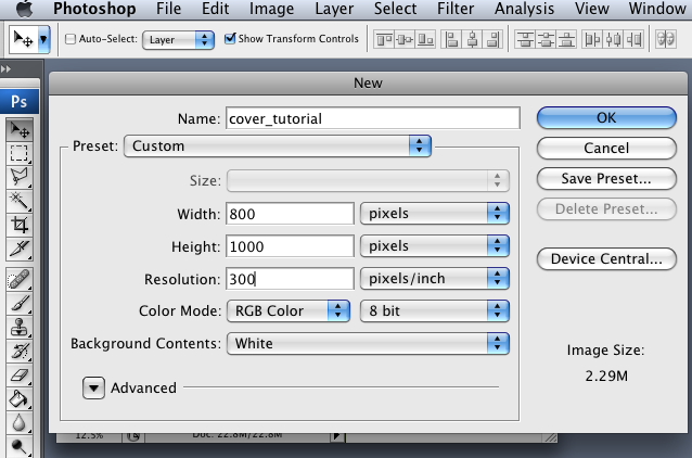
So I created a new file that is 800x1000. Then I dragged my flower pic into the new file.
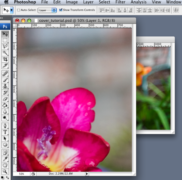
Now the first thing I am going to do is duplicate the layer containing the flower pic:
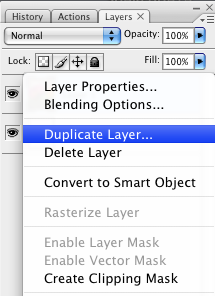
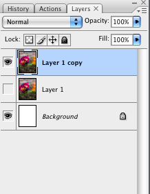
This way, if I mess things up I can always start again from the original flower without needing to import it again. I can also use the original layer to compare before and after looks.
Next, I resize (command-T in Photoshop) the flower and move it to the position I want:
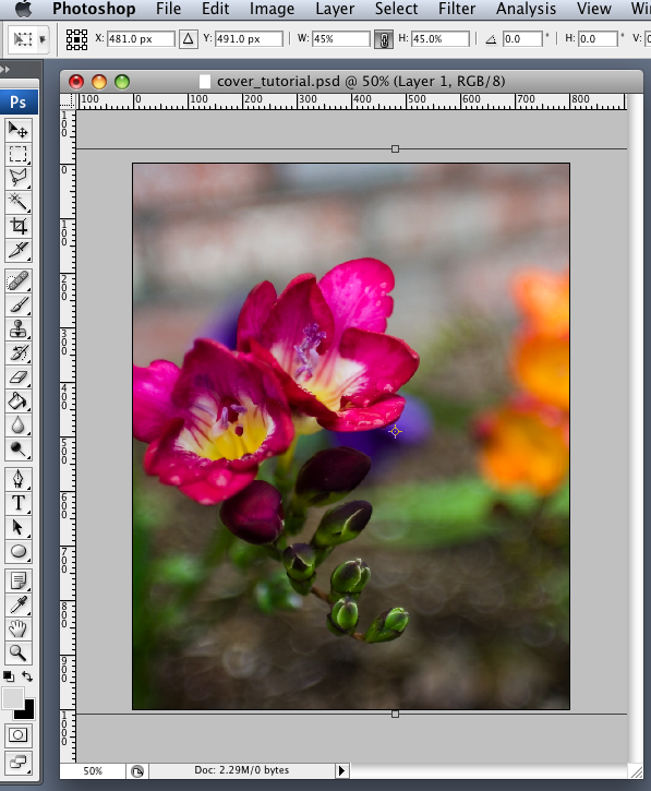
I'm leaving some space at the top and bottom for the title and author name.
Check out the Rule of Thirds for some info on how to compose an image.
It just means that pictures seem to look better if they aren’t centered. Got it. Next?
Check out the Rule of Thirds for some info on how to compose an image.
It just means that pictures seem to look better if they aren’t centered. Got it. Next?
Now is a good time to talk about color. Here’s a color theory explanation about why all movie posters look the same. Bottom line: colors at the opposite side of the color wheel have good contrast.
Ok, so if it’s good enough for movies that can make nine figure $, then it’s probably good enough for a shoestring budget indie author. In a nutshell, we want to use contrasting colors. Check. Next?
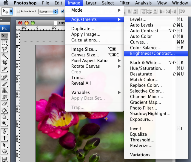
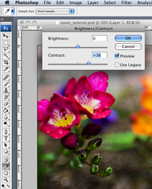
I want to darken the background of the flower a bit. The background already has a nice soft out of focus look (known as bokeh in photographer lingo.) But I want to make the flower stand out even more from the blurry background.
So I increase the contrast:
Now I want to make it look a bit more like a piece of artwork, instead of a picture. So I’ll apply a Dry Brush filter:
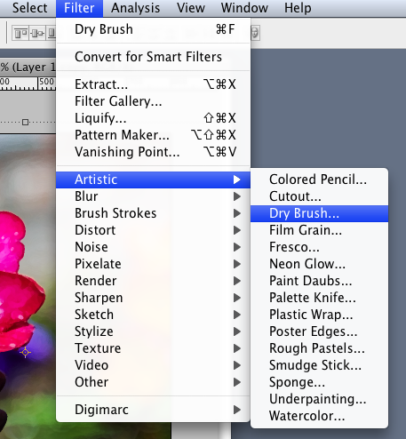
You can fool around with the Dry Brush settings until you like how it looks.
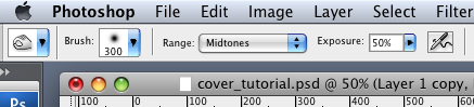
Next, I am going to use the Burn Tool to make parts of the background even darker.
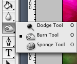
I choose a big soft brush for the Burn Tool, so the darkening effect will be gradual. I don’t want to over do it:
So now the cover looks like this:
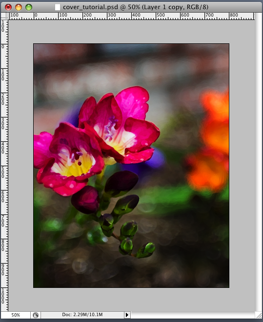
Already it has more production value than just a snapshot of a flower. It looks kind of like somebody painted it, and the flower really stands out from the background.
But we need something more to make it a Galactic Flower. Here’s a pic of the Rho Ophiuchi Cloud I got from NASA:
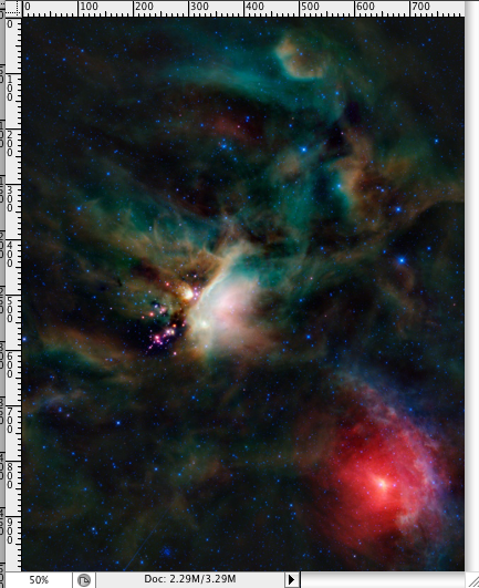
I checked the copyright and license info to make sure it’s okay to use.
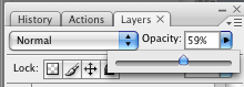
Next, I import the Cloud into a layer above our flower and set the opacity of the Cloud to 59%.
I don’t want the Cloud to cover up the flower, though, so I use the Eraser Tool to gradually erase parts of the transparent Cloud, to reveal more of the flower:
You can’t wait to see what happens next, right? Okay, we started with just the flower:
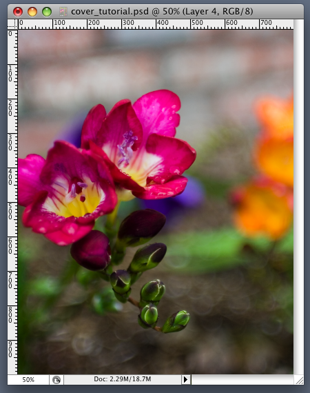
Then we adjusted the contrast, added a Dry Brush filter, and used the Burn Tool to make the background darker:
Then we added a picture of stars from NASA, made it transparent, and erased part of it to reveal more of the flower underneath:
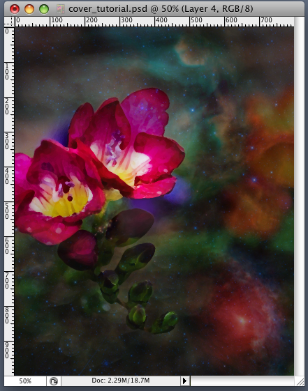
There we have our Galactic Flower that looks like it is floating in a nebula.
Next, we add words:
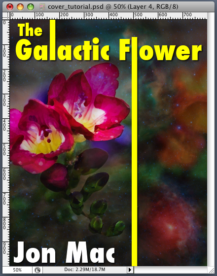
I added a small drop shadow and a slight black outer glow to make the words pop out from the picture. Look at the covers of books you like to see how they designed the words and what kinds of fonts they used. Learn from what is successful. Little tricks like making "the" smaller and on a different line make it look more professional. I also extended the "L's" to customize it a bit. You can also experiment with cutting out part of the letters to make it look more like a unique font, or italicizing certain letters. Also experiment with individual letter size and caps. Again, take a look at covers of books you really like and practice duplicating their title/author/font arrangement to get the hang of it. Then come up with your own design.
There it’s all done. Here is how it looks as Kindle Store sized thumbnail:
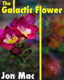
It could use some tweaking, but it's pretty readable, seems to stand out and gives you an idea of what you can do.
Now get to work and give it a try!
Fab tutorial. Enjoyed this. Glad to bump into you on this blogathon. :D
ReplyDeleteHey M Pax - I'm glad you liked it! Yeah, I'm new to the whole blog thing. It's a bit overwhelming sometimes :)
ReplyDeleteThis is insightful
ReplyDeleteVery helpful tutorial. Thanks for sharing your knowledge!
ReplyDeleteYou're welcome :)
ReplyDeleteJust wanted to say I used this tutorial to make the cover art for my book, "My Indian Queen: A Novella," and I'm very pleased with how it turned out.
ReplyDeleteLink is here: http://www.amazon.com/My-Indian-Queen-Novella-ebook/dp/B007Z1IE50/ref=sr_1_1?ie=UTF8&qid=1337871781&sr=8-1
Thanks!
Great Photoshop I here is hard to understand, I have netpaint but I do not know how to use it either.
ReplyDeleteThere's tons of good tutorials on the net, Lisa. I have found over the years that you can accomplish a lot just by fooling around with it, then google-up a tutorial to find out how to do something specific.
ReplyDeleteThank you so much for this! I can't afford a professional, so I downloaded GIMP (free!), and discovered it works virtually identical to Photoshop Elements. I have now made 4 covers for my 4 books, and as soon as I am done editing, I will use my own covers with my own photos and a lot of GIMP - and this article open every step of the way - and post my books! I never would have known how to start without this. Thank you again!
ReplyDeleteI'm excited about learning how to create an eye-catching ebook cover.
ReplyDelete